A brief history of CX KPIs
Each day, our experiences with brands reshape our perceptions of them. These perceptions then influence our behaviour, which has a direct impact on sales. Researchers have, for decades, sought to measure how experiences shape behaviour as a key determinant of commercial success.
I’ve been thinking about the endless debate around how we measure the outcomes of experience. Harvard Business Review articles have appeared regularly espousing new advice about what we should be measuring. In the 70s, it started with Overall Satisfaction. Then we were told to measure Overall Performance because the experiences should match the value of the customer. Then loyalty was the thing because satisfied customers often leave and what we really care about is lifetime customer value.
Around the turn of the millennia, Fred Reichheld, Bain & Company invented the Net Promotor Score (NPS). This was the ‘one number that matters’ and it spread like the pox.
Confused? I was. Cynical? I still am.
Are we measuring the same thing repeatedly? How we have tried to answer this question:
How do these measures all relate to one another? If you ask someone to rate satisfaction, loyalty, performance and advocacy, are they just expressing the same feeling in different ways? Is the fine tuning of scaling around different measures just over clever sophistry? The answers to these questions matter. Every question we ask on a survey adds to its duration. The Evolved Group engages with over 6 million people a year and if asking four questions instead of one takes an additional minute, then we have taken up 83,333 hours (3,472 days) of their time. That’s not very respectful of people’s time, which is something we care about at The Evolved Group.
To get some answers, we decided to ask over 700 Australians to rate their superannuation fund performance on:
- Satisfaction
- Performance / Experience
- Net Promoter Score (Advocacy)
- Loyalty
Our method of data collection was a traditional online survey from a large research panel. Apologies to the panel members for inflicting this survey on them, as it goes against our ethos. But we needed to know, in the name of science!
For the data heads, here are the results in table format. This shows for each metric the distribution of results on a 0-10 scale and identifies significant column differences at the 95% confidence level.
| Column % | Fund Satisfaction |
Fund Experience | Fund NPS | Fund Future Intent |
| A | B | C | D | |
| Negative Scale anchor | Extremely Dissatisfied | Extremely Poor | Not at all likely | Not at all likely |
| Positive Scale Anchor | Extremely Satisfied | Excellent | Extremely Likely | Extremely Likely |
| 0 | 1% | 1% | 4% ABD | 1% |
| 1 | 1% | 1% | 1% | 1% |
| 2 | 1% | 1% | 3% | 2% |
| 3 | 2% | 2% | 3% | 2% |
| 4 | 3% | 2% | 3% | 2% |
| 5 | 9% | 9% d | 17% ABD | 6% |
| 6 | 8% | 8% d | 8% d | 5% |
| 7 | 16% d | 14% | 16% | 12% |
| 8 | 20% | 21% | 18% | 18% |
| 9 | 19% C | 19% C | 13% | 18% c |
| 10 | 17% | 17% | 14% | 28% ABC |
| TOTAL 0-4 | 8% | 7% | 13% ABD | 7% |
| TOTAL 0-6 | 25% D | 25% D | 38% ABD | 18% |
| TOTAL 6-10 | 79% C | 79% C | 70% ABD | 81% |
| TOTAL 9-10 – T2B | 36% C | 36% C | 27% | 46% ABD |
| Note sure | 4% C | 4% C | 0% | 6% abC |
| Mean (Exc DK) | 7.5 C | 7.5 C | 6.8 | 7.9 ABC |
| n= | 746 | 746 | 746 | 746 |
How we can interpret these results:
- NPS is clearly behaving differently to the other measures. One thing that worries me is that more people are using ‘0’. I don’t like that NPS is scaled from 0 ‘Not at all Likely’ to 10 ‘extremely likely’, which is different to all the other scales that have negative 0 anchors. I think most people interpret the ‘0’ anchor as a negative anchor point as opposed to indifferent or not-advocate. The other issue is that the NPS question, when interpreted literally, can be answered in the 0 to 6 range simply due to indifference. e.g. I would not recommend my super fund because I don’t recommend things generally. In short, NPS offers a more diverse use of the scale, but probably not for the reasons we want or have been told. Of note, the actual NPS value is -11 (27% rated 9-10, minus the 38% who rated 0-6), meaning we are in net detractor territory in a category where 79% of people are satisfied (i.e. rated 6-10).
- My second observation is that satisfaction and performance, perhaps expectedly, are measuring precisely the same thing. My interpretation is that you can measure one or the other – but you should not measure both.
- That leaves Future Intent (AKA loyalty). Future intent has a strong skew towards the positive end versus the other scales, likely reflecting that most people will tolerate a level of poor performance and remain a customer. That’s good to know but it doesn’t help you understand where to improve and it comes at the cost of less variation in the scale. Variation unlocks information and insights.
The table below shows the Pearson’s Product Moment Correlations between these measures.
- All measures are significantly correlated
- Satisfaction most correlated with Experience
- NPS has the lowest correlation with the other measures overall
- Future intent is more strongly correlated with Satisfaction and Fund Experience than NPS
| Correlation factor | Satisfaction | Fund Experience | Advocacy* | Fund Future Intent |
| Satisfaction | 1.00 | 0.91 | 0.78 | 0.87 |
| Fund Experience | 0.91 | 1.00 | 0.78 | 0.84 |
| Advocacy* | 0.78 | 0.78 | 1.00 | 0.72 |
| Fund Future Intent | 0.87 | 0.84 | 0.72 | 1.00 |
* Note that I’ve used advocacy in this table because we are correlating the 0-10 score not the NPS
Hang on – this is telling us that some people will advocate for their fund that they will not use in future. Does that make sense? It does, but not in a good way. The table below shows that 16% of the total sample were detractors who rated their future usage intent in the 7-10 range…i.e. not likely to leave. This explains the low correlation between NPS and future intent.
| Total % | NPS detractor (0-6) | NPS neutral (7-8) | NPS Promoter (9-10) |
| Future intent 0-4 | 7% | 0% | 0% |
| Future intent 5-6 | 10% | 1% | 0% |
| Future intent 7-10 | 16% | 32% | 27% |
| Not sure | 5% | 1% | 0% |
| Mean Future intent | 6.1 | 8.3 | 9.7 |
One interpretation of this group is that they are the notorious ‘barnacles’. Brand trashing people that are too lazy to leave. Stuck in a negative relationship where the cost of exit is too high or there is simply nothing else better on offer. Sadly, however, that is simply not the case. When we filter our EVE conversations against this 16% of loyal ‘detractors’ we see typical feedback as follows:
Hi, I’m Eve. I’d like to further understand how you feel about your current super fund. To start off, could you describe how you currently feel about it and why you feel that way?
I don’t really have any feelings about it. It’s what I was automatically put on when I started working and haven’t really looked into it further
Thanks for that. What are the positive aspects of being a member of your current fund?
I have super
And what can your current super fund do to improve member experience?
Make sure they’re investing in renewable and ethically sound resources
Let’s now have a look at satisfaction and future intent. For easy comparison we have kept the scale ranges aligned with NPS categories. You can see from the table below that the proportion of dissatisfied fund members who rate future intent in the 7-10 range has dropped to only 7%. This is largely an artefact of using 5 and 6 as our negative range to align with NPS. If I change the crosstab to only look at the 0-4 satisfaction rating, future intent drops to just 1%. In fact, if you piss people off, most will leave, or at least say they will.
| Total % | Satisfaction rated (0-6) | Satisfaction (7-8) | Satisfaction (9-10) |
| Future intent 0-4 | 7% | 0% | 0% |
| Future intent 5-6 | 9% | 2% | 0% |
| Future intent 7-10 | 7% | 33% | 35% |
| Not sure | 3% | 1% | 0% |
| Mean Future intent | 5.2 | 8.1 | 9.6 |
…and now the drum roll, the final piece of the puzzle. NPS versus satisfaction as shown in Table 5 below.
| Total % | NPS detractor (0-6) | NPS neutral (7-8) | NPS Promoter (9-10) |
| Satisfaction 0-4 | 8% | 0% | 0% |
| Satisfaction 5-6 | 15% | 2% | 0% |
| Satisfaction 7-10 | 12% | 32% | 27% |
| Not sure | 3% | 0% | 0% |
| Mean Future intent | 5.6 | 7.9 | 9.4 |
The key points we can see are that 12% of those who are detractors are also happy fund customers. This is strong evidence that stated advocacy (aka NPS) is not a very good measure of either future intent nor satisfaction and that people don’t advocate for reasons other than the experience with the brand. That’s why many researchers do not like NPS as a measure. Frankly, it is dodgy because of poor scale design.
Back to the future?
All these scaled constructs are affective measures of an emotional state resulting from experiences. NPS and Future Intent purport to measure behaviour while Satisfaction and Performance are affective measures i.e. just a mind state. But really, I think they are all mostly measuring the same thing. My advice is measure Satisfaction and if you must, Future Intent, noting that there is always the lingering doubt that what people say they will do, is not what they end up doing. If you want to benchmark, by all means use NPS (or eNPS). Its value lies in its consistent application across organisations. If you don’t want to benchmark, I do not recommend using NPS. Overall, the key remains to measure SOMETHING that people can get around, easily understand and which motivates improvements.
Future to the future?
Full disclosure, when we ran this fascinating study, we also asked the same respondents to rate their feelings about their super fund using “Smile Badge”, our non-verbal ratings scale. We also asked them to chat with our Conversational AI feedback companion, EVE, about their fund performance. Here’s my question – if we are just measuring an affect, do we really need to state what we are measuring at all? Could we just use the good / bad scale with some visualisation of that mind state? Why get the respondent to rate anything at all if you can use precise text analytics to measure sentiment accurately. Let the words themselves that tell the story.
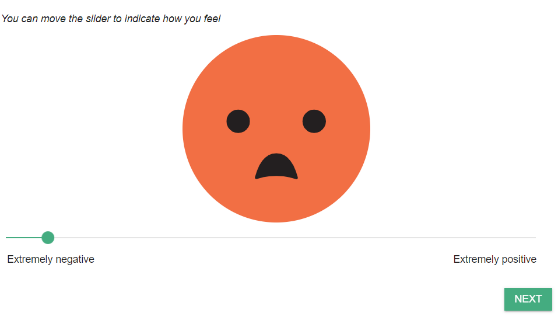
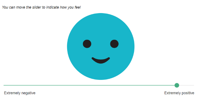
Let’s start by introducing Smile Badge. This is how we positioned the scaling below. You will note that we have anchor points on the slider – that is strictly speaking, not necessary. As you move the slider left and right the face changes to express the feelings. This gives respondents a clear cue to introspect their own mood stage.
| I am feeling negative | I am feeling positive |
 |
 |
The underlying scaling is 0 to 100. Each movement of the slides shifts the image 100th of a degree from the most positive to the most negative. Now this is a sensitive scale! Let’s see how the faces look when we compare them to the same set of ranges for NPS, Satisfaction and Future intent.
| (0-6) | (7-8) | (9-10) | |
| NPS |  52.5 |
 68.9 |
 82.7 82.7 |
| Satisfaction |  46.6 46.6 |
 66.0 66.0 |
 81.9 81.9 |
| Future Intent |  45.8 45.8 |
 62.8 62.8 |
 78.6 78.6 |
Visually, looking at the smile badge, you can see how little the feelings of the customer vary irrespective of the scale you use. The main difference is that so called ‘detractors’ in NPS tend to be a little less peeved than dissatisfied customers and people who want to go elsewhere. We think Smile Badge is a great way to scale your KPIs because its face is a universal, cross-cultural symbol of sentiment.
Even more importantly, when we looked at the sentiment scoring of our EVE conversations, we don’t need to ask the overall question at all, because the affective emotional state can be extracted implicitly from people’s use of language. Imagine how much time we could have saved collectively across the billions of surveys conducted over the last 50 years if we just listened. If only the technology had allowed us to do this, as it now does.
This is another compelling proof point about why Conversational Engagement is better. Here is the same table as above, but this time showing average sentiment scores (-1 most negative to 1 most positive) calculated using our Human Listening™ API versus each KPI measure.
| 0-6 ratings | 7-8 ratings | 9-10 ratings | |
| NPS | 0.33 | 0.47 | 0.64 |
| Satisfaction | 0.25 | 0.48 | 0.60 |
| Future Intent | 0.22 | 0.40 | 0.61 |
This is very promising because it shows we can passively measure something equivalent to traditional explicated scaling of satisfaction, sentiment, or loyalty without even asking. My interpretation is:
- Once again, NPS is shown to have defects in the 0-6 range. It is not really composed of detractors. Here are two examples of NPS 0-6 detractor rated comments that clearly illustrate indifference:
“I really don’t have an opinion … I was recommended it as a good fund for health care workers … I have no opinion …”
“I don’t feel much about it – it’s there and my money goes into it … They are trustworthy and I think it’s safe … I don’t know …”
- More positively, and possibly importantly for the sake of everyone’s time, there is a very strong correlation between sentiment as a measure and satisfaction and loyalty. This bodes well for using sentiment itself as our dependent variable.
For the record, here are some example comments scored in each range to give you a flavour of the types of responses that are negative through to positive.
| Sentiment Score range | (EVE Probing) – Hi, I’m Eve. I’d like to further understand how you feel about your current super fund. To start off, could you describe how you currently feel about it and why you feel that way? – Thanks for that. What are the positive aspects of being a member of your current fund? – And what can your current super fund do to improve member experience? |
| -1 to -0.5 Very negative | High charges, poor returns, difficult to withdraw your funds The only good thing is that they have death and disability insurance attached to the super fund. Cut their management fees, get someone on the board who isn’t a political appointment. |
| -0.49 to 0.0 Negative to neutral | We are in a recession so will possibly lose money Industry super fund Nothing |
| 0.01 to 0.5 Neutral to Positive | I have no issues with them, generally i earn a decent return on my investments they have a life insurance policy as well that covers me give me a better return and charge less fees |
| 0.51 to 1 Very positive | It is a generic super brand that I have with my employer. It provides regular updates on how my fund is doing and that I can add to it easily with salary sacrificing Have an online app where I can check the balance easily via my phone |
Summary and further thought starters
An overall KPI question gives you a dependent variable to lean on in your analysis. However, with modern, accurate text analytics, we may not need to ask this question at all.
Some decades ago, I fell in love with a model by a guy called Richard L. Oliver, called Expectation Confirmation Theory.
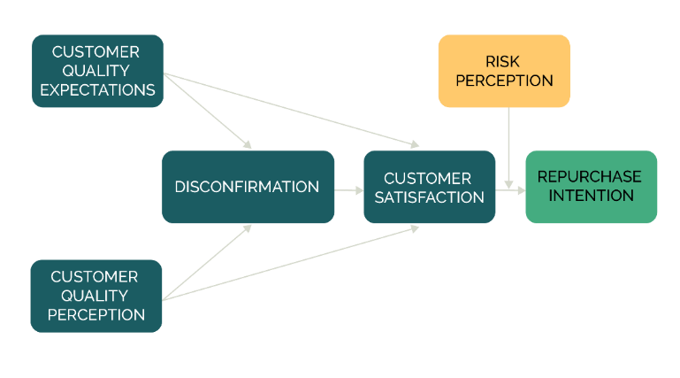
This model gets to the heart of what we are really measuring, no matter what question we ask. We are measuring whether expectations are met. Yes, it is that simple. The brilliance of Oliver is that he identified that for all experiences, we have a Zone of Tolerance (ZOT) and that is what determines our affective judgement of experience.
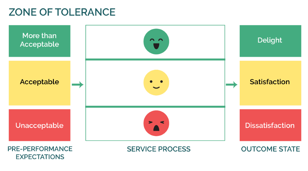
Simply, if I have low expectations then relatively average performance is likely to be ok. If I have high expectations, it is not. All sorts of ideas flow from this including service design on how to define minimum standards, target setting and managing affective outcomes by setting expectations before experience, product tiering. Pretty much everything. I can even state with some certainty that it is performance outside of the ZOT, sometimes called ‘delight’ that drives future loyalty and performance below the ZOT, sometimes called ‘disappointment’ that drives negative advocacy and defection.
So what now…
I recently rewatched the Big Lebowksi, one of my favourite films (if you haven’t watched it, do yourself a favour). An apt analogy is that the ZOT model is like the Dude’s rug, it ties the whole room together.

If we are to ask any overall KPI or dependent variable, then I think we should ask whether service or product met expectations i.e. below expectations, met expectations or exceeded expectations. Tied to sentiment scoring and text analytics, this potentially gives the best indication of likely behavioural outcomes, tied to specific levels of service in turn, tied to defining experiences. It also implicitly tells us where to aim for.
…and that is exactly what we are going to try on our experiment next. Stay tuned.
Find out more
To learn more about our CX capabilities, visit our Customer Experience & VOC page.